Evaluation.

Above is my first choice for my one of my three final prints. I chose this because I think it is one of my best pieces I have done so far. Creating this piece, I have learnt how to use the red spray paint tool in Photoshop. I like this effect as it gradually gets darker the more you use it. It also is quite transparent, which I quite like about this brush. For making the colour skin, I selected the Oval Paintbrush, which layers colours slowly, giving it a gradual look ideal for making a pale skin colour. I picked a yellow-orange colour which was perfect making the skin tone. I coloured the face in using the oval tool which gave it a natural look,that I quite like.
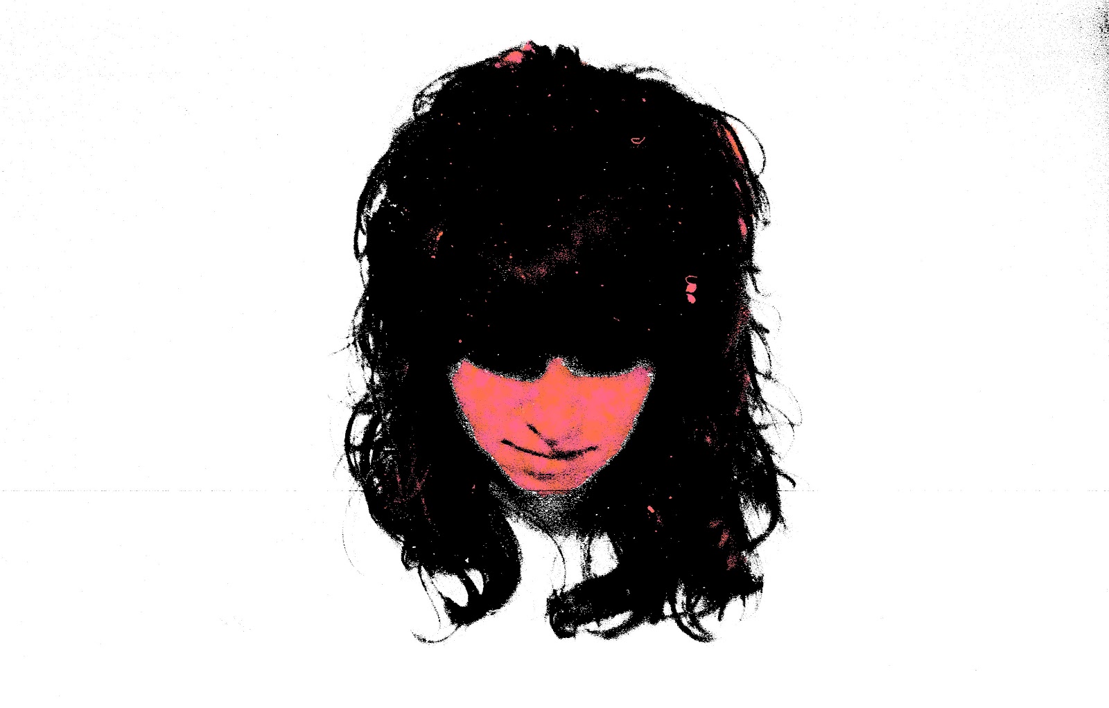
This is one of the first images that I created on Photoshop for my blog. At first I was only messing around getting used to the tools, however I quite like what I made. I learnt how to download brushes off of the internet creating different effects. For example with this image, I downloaded a "Moss Brush" which helps make block colours less thick and mix together two colours. Like with the image I have done here, I used a pink/orange colour which helps lighten the colour and slightly more transparent. I quite like this effect as it slightly reminds me of Banksy's work. I really like this image and I shall be using it in my portfolio as it presents me work quite well.

Finally, this is the last image I have chosen to evaluate. I created this by tracing an image I found off of Google Images, and then scanned it in, into Photoshop. First I thickened the hair, eyes and wrinkles, with just a basic black brush. Next, like my first image, I used the Oval Paintbrush to create a natural dark skin tone. I filled in his face and then began to highlight his features; Eyes, nose and mouth. Next, I drew in the cigarette as I left this out whilst tracing as I felt it would look better if I did it myself. After that, I painted in the top of the shirt and suit. When tracing the original image, I found it quite hard to trace the shirt, so I decided to make it myself. Next I inserted an empty New York street the show that he was a business man as he looked quite professional. While doing this, it change the colour of the cigarette, however I quite like this effect. I quite like the outcome of the image, as it seems cartoon-like, yet also very realistic.
Overall Evaluation.
When starting this project, I didn't have much interest in it as I did not have many skills or understanding of Photoshop. However going through the unit, I slowly learnt how to do new things. For example, I learnt how to use the "Quick Selection Tool" which is used to highlight a certain area and then fill it with a colour, without affecting the surrounding area. Another skill I have learnt is how to insert backgrounds and objects, as I found that I first started using Photoshop that I couldn't do it at all. I also learnt how to use the spot "Spot Healing Brush Tool" which helps change the colour of small detailing, making it look slightly cloned. This helps when Photoshoping portraits to give a perfect skin look.
I quite liked using eblogger as I find when creating a work book I tend to leave a lot of the work to the last minute, therefore creating an online workbook suits me well, as I prefer typing to writing, as well as simply transferring my images across, instead of having to print them out with the possibility of damaging them. I have chosen, for my final image, the image of the girl with a red strip across her face. I like this image because it displays my talents well and the skills that I have learnt throughout this unit. I think the image is quite simplistic yet interesting.
I think I have done well in this unit when managing my time well. I made a new design every week and this helped fill my blog with a variety of techniques. After making a design, I posted it only my blog straight away and wrote about it in a lot of detail. This helped me keep up to date and not left behind. If I were to repeat this unit, I would shoot more, so that I can use a more variety of images in Photoshop to edit. However, with not doing this, I traced more images of other people's work so equally I have done well with fitting in the criteria.


