Tuesday, 28 February 2012

I decided I wanted to create a silhouette with writing inside. I did this by taking an image off of Google and removing the inside picture and background. I kept a black line around the Wolf image, to keep structure and make the image more definition. On another layer, I ensured that the background was pure white to make more contrast between the writing and the outline. Next, I downloaded a writing brush for Photoshop, and filled in the Wolf. Although I like the outcome, I think the Wolf looks a little too much like a Cow.
This is the original image that I used to create a silhouette of the above image. However it didn't come out as well as I had hoped for.

Monday, 27 February 2012

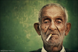
To create this image, I traced a picture of an elderly man, smoking. I then scanned it into Photoshop and started editing it by increasing the contrast and decreasing the brightness. Next, I man the skin darker then what it was originally. I also shaded the hair in, from a light grey to black. This makes the man look younger, however the wrinkles on his face still age him. I then thickened the grey pencil lines giving the image more volume and made the tip of the cigarette red. Finally, I inserted a busy city street in the background to give the image seem more realistic.
This is the original image that I used to trace and scan into Photoshop. As you can tell, I highly edited it, as the original is completely different from the final product.
To create this image, I traced an ordinary image off of Google Images and scanned it onto Photoshop. I then thickened some of the lines of the face to create more contrast from the black and whites. I then made a pale skin colour to the face, to give the image more realism. Next, I made the eyes black giving it more of a cartoon effect, inspired by David Foldvari. Finally, I added a strip of red across the face, which gives the image colour. I like the outcome and I think it's my best design so far.

This is the original image. I quite like it as a photo on it's own, however I quite like my version of the image, as it doesn't look as if I'm down grading the image, and doesn't really look like the original anyway.  Overall, I like both images, and I feel this is my best piece.

Friday, 10 February 2012

Here is an image I created on Photoshop, editing my original image. I found that the outcome looks a lot like Banksy. To do this I first increased the contrast to as high as possible to make the whole image black and white leaving the rest completely blown out. Next I added strips of translucent colours across the face which reminds me of Patrick Morgans work. I then added the brick layering behind, which also changed the colour of the faces and the person on the rights body from white to brick, although I like this result. Overall I like this image, I feel I am becoming faster at editing images and making graphic designs.
This is the original image, I like both the original and final. I think the original is quite a simplistic and effective photograph. Although I like the edited version, I prefer the original as it's minimalistic and can see their facial emotions.

Monday, 6 February 2012

From looking at Patrick Morgans work, I decided to try and apply his techniques to my own photography. To create this image, I made the image completely black and white, I then increased the contrast to as high as possible, to give a sketch look. Next I used a water colour brush to add colour on the head and body. Finally, I changed these colours to make them transparent, so that you can still see the image but still has colour in it. I like the outcome as I think it's simplistic yet effective.
This is the original image. I found that all the image from this shoot were a bit over exposed, however this made it ideal for the edited image that I made at the top. I found it quite easy to take away the colour and over expose it even more. I prefer the edited piece to the original.
Here is an image I took, for a previous unit, of a friend. To get this result, I made the contrast of the image very high, to give it a sketch drawing look to it. I then used the magnetic lasso tool, to cut out the face to apply colour. I downloaded a "moss brush" which combined pink red and orange into one brush to colour the face. However this colour was too dark, so I then made the top layer more transparent so the lips and nose would show. I also added colour in the hair, to give it more definition. I like my final outcome as this was purely a mess around on Photoshop.
This is the original image. As you can tell, in comparision to the final product, it has been highly edited, and I think it looks similar to the work of Banksy. I like the outcome quite a lot.
By using downloaded brushes onto Photoshop, I re-invented this image of Bob Marley I found on Google. First I made the image black and white using Greyscale, and then changing the contrasts levels. By doing this it made the orange and red glow between the black and white colours. Then I used a brick brush I downloaded to add a unique background. I like the outcome as this is my first attempt at creating a graphic image, although I could use some improvement.

Friday, 3 February 2012

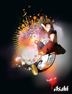
Above is Jack Daw's highly editted image of a woman jumping away from an explosion of colour. I like Daw's work as he introduces colours and patterns in the appropriate places (not at random selection) giving action to an image. For example one above would be a normal image of a woman jumping however, by adding the graphics, it gives it more depth and understanding.
I believe Daw used a lot of layers creating this image. The whole image includes intricate detailing, if you look closely, you can tell that Jack Daw has inserted small images of a bottle and bottle caps. I believe Daw has used about 30 layers on Photoshop to create this. I believe this as there are many small detailing, including tiny flowers and swirls, as well as larger speckles of paint and swirls. I like this image, however I don't think I'd be able to do something to this high of a standard as it takes a lot of patience and high knowledge of Photoshop and a variety of it's tools. 
This piece is called Pierre Cardin by Patrick Morgan. I like this, as Morgan adds colour to the image, it still looks like a realistic person. I hope to be able to recreate images like this using Photoshop CS2 or CS5.