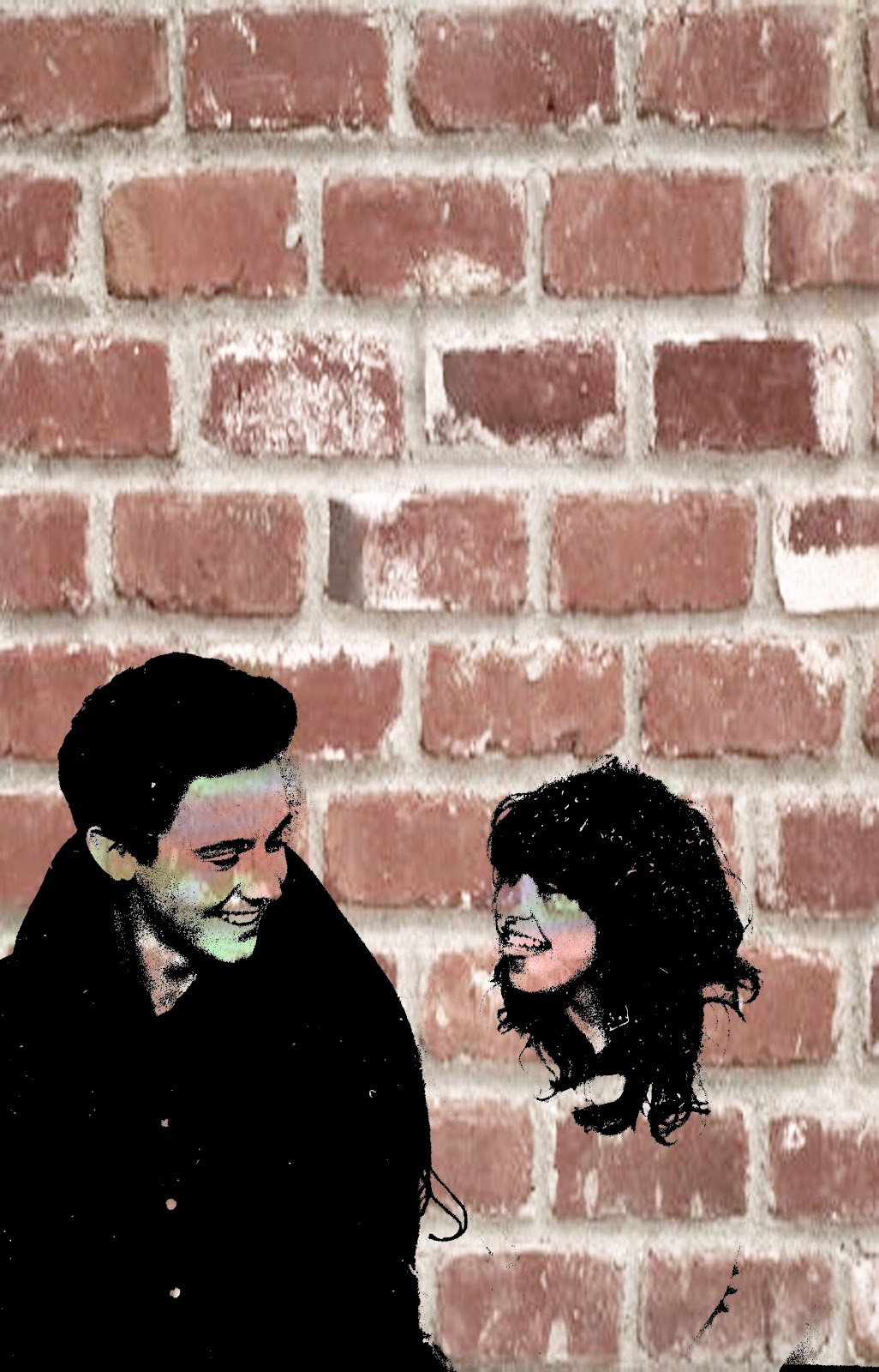
Here is an image I created on Photoshop, editing my original image. I found that the outcome looks a lot like Banksy. To do this I first increased the contrast to as high as possible to make the whole image black and white leaving the rest completely blown out. Next I added strips of translucent colours across the face which reminds me of Patrick Morgans work. I then added the brick layering behind, which also changed the colour of the faces and the person on the rights body from white to brick, although I like this result. Overall I like this image, I feel I am becoming faster at editing images and making graphic designs.
 This is the original image, I like both the original and final. I think the original is quite a simplistic and effective photograph. Although I like the edited version, I prefer the original as it's minimalistic and can see their facial emotions.

No comments:
Post a Comment